Changing Contrast
CONTRAST is when two things are strikingly different from each other. In color, contrast can be achieved
through all three components of a color (hue, value and intensity/saturation).
This idea is helpful in design:
When you have HIGH CONTRAST the eye is drawn to the area, particularly where the contrasting
elements meet. However, this is also tiring to the eye and too much high contrast can be hard to look at
for any length of time.
High Contrast: Hue - complementary colors have the greatest contrast in hue (ie: red and green)
Value - black and white have the greatest contrast in value
Intensity - a bright hue and a very gray tone have the greatest contrast in intensity
When you have LOW CONTRAST it is restful to the eye and allows the viewer to look around the design.
However, low contrast can quickly seem boring to a viewer.
Low Contrast: Hue - analogous colors have the least contrast in hue
Value - values near each other have low contrast
Intensity - - dull hues (lots of gray added) have low contrast
A designer can help control the effect of a design by using high and/or low contrast. Because every color
has all three components, the contrast of hue, value and intensity should all be considered in a design.
In other words, having two high contrast hues with low contrast intensity will affect the overall contrast.
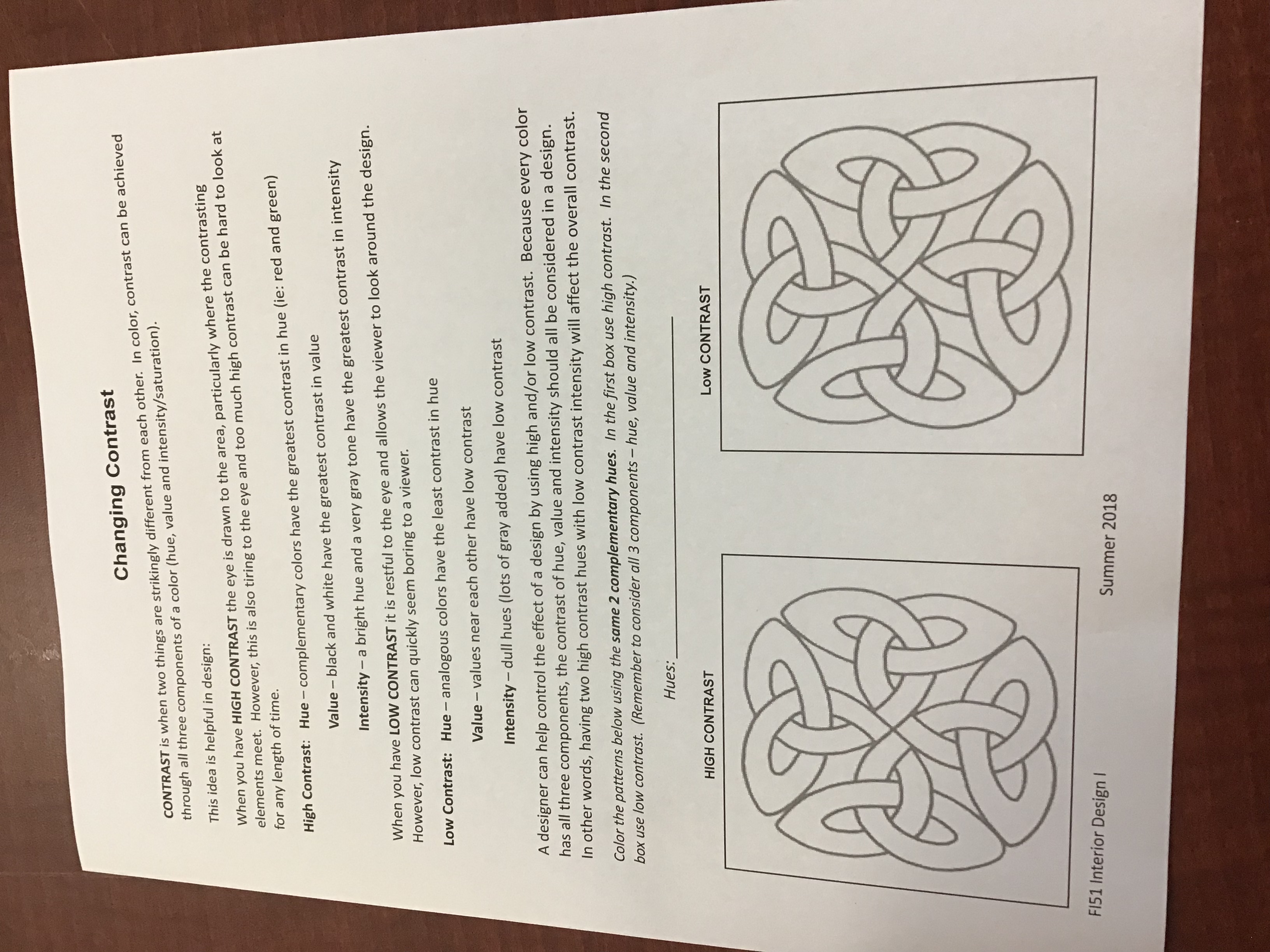
Color the patterns below using the same 2 complementary hues. In the first box use high contrast. In the second
box use low contrast. (Remember to consider all 3 components - hue, value and intensity.)
Hues:
HIGH CONTRAST
Low CONTRAST
FI51 Interior Design I
Summer 2018


